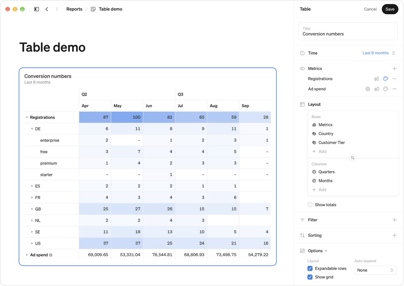
Tables let you add multiple metrics and break them down by multiple dimensions. Expandable rows let you drill down level by level, from country to city, with a total at every level. Comparisons, targets and colors are set per metric.
Coming from the old tables?
Everything you could do in the old tables you can still do, but a lot of it has moved.
- All settings now live in the edit panel. Before, some settings sat on the table itself and others in the edit panel. There is now one place for everything.
- Targets, compares and colors are added next to each metric in the edit panel, instead of by clicking the metric in the table.
- Sorting has its own section. It used to be an option under each breakdown.
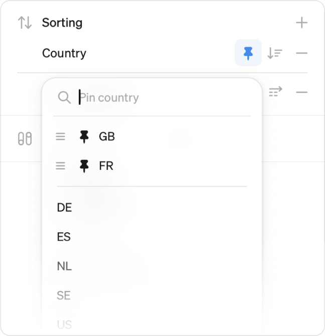
- Manual ordering works differently. You used to drag dimension values around in the table itself. Now you pin the values you care about and drag your pinned values to reorder them.
- Breakdown limit is now a filter. Limiting a breakdown to its biggest values is a top X filter. Any Max items you had set carries over as one.
And some things are new: multiple breakdowns on both axes, expandable rows with totals at every level, and the option to put compares and targets on the columns, which gives you layouts that were not possible before.
Add a table
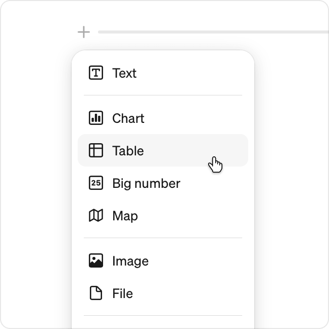
- Hover over the report to find the + button
- Click it and choose Table
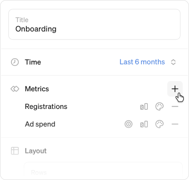
- In the edit panel, add your metrics
- Add a title
- Click Save
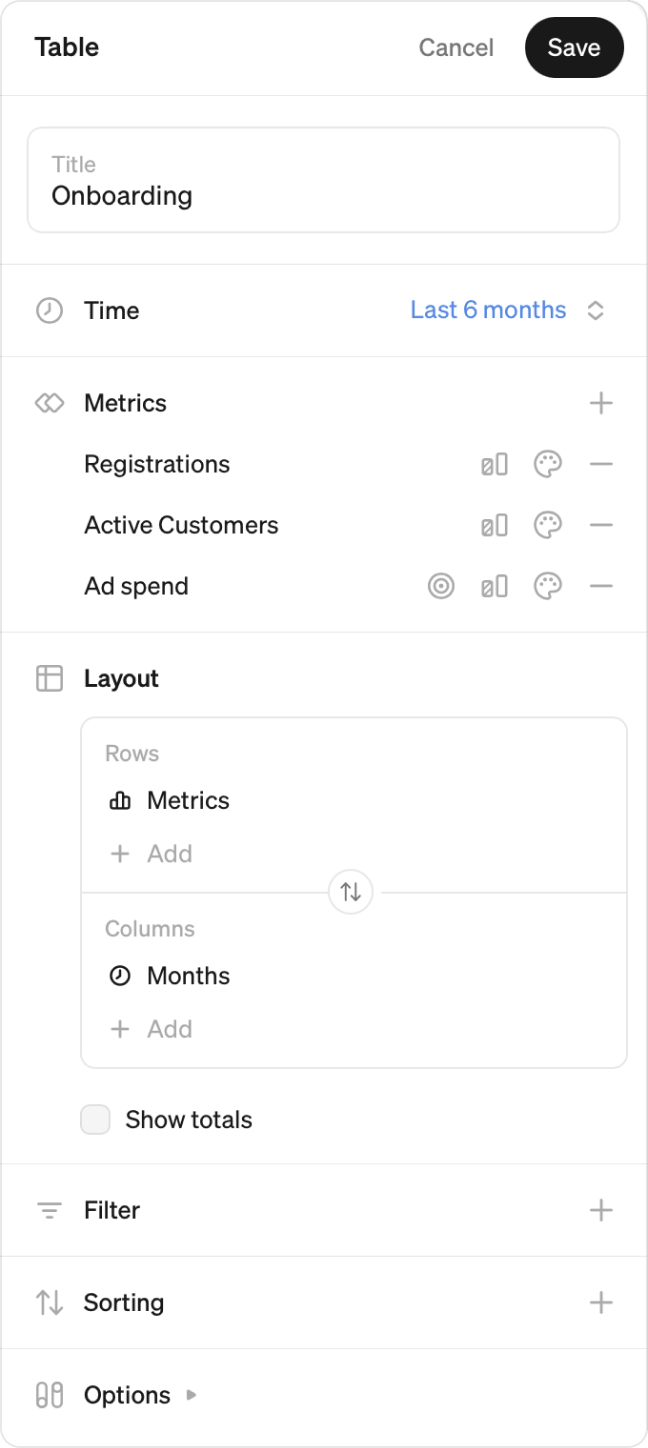
A new table starts with Metrics on the rows and Months on the columns, so one metric is enough to see numbers. Everything else is optional.
The edit panel
Everything about a table is set in the edit panel on the right. Each section is covered in detail below.
- Title: the name shown above the table
- Time: the time period the table covers
- Metrics: which metrics to show, and their comparisons, targets and colors
- Layout: which breakdowns and time grains sit on the rows and the columns, and whether to show totals
- Filter: which values to include
- Sorting: the order of rows and columns, and any pinned values
- Options: expandable rows, where compares and targets appear, and comparison period
Time
In the Time field, choose the time period for the table. Tables display the last 6 months by default.
Tables can use a fixed or a rolling time period. Read more about fixed and rolling periods.
Metrics
Add and remove metrics
Click + next to Metrics to open the metric picker, then search for and select a metric.
Add multiple metrics, and drag them to reorder. That order is the order they appear in the table. To remove a metric, click the minus next to it.
Compare over time
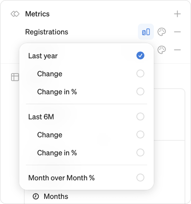
Each metric carries its own comparisons. Click the compare icon next to a metric to compare against the same period last year, the previous period, or period-over-period as a percentage.
For each comparison, you can also add Change and Change in % to show the absolute and percentage difference.
Targets
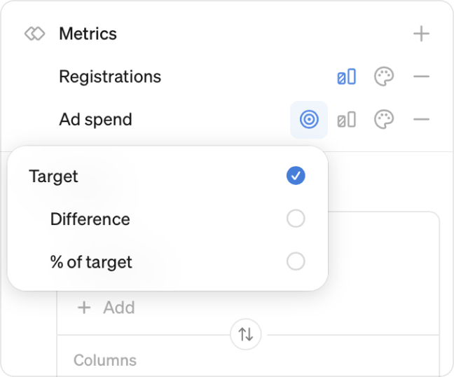
If a metric has a target associated with it, a target icon appears next to the metric. Click it to add the target to the table.
Alongside the target value, you can add the difference to target and the percentage of target as their own rows.
Read more about targets.
Colors
Color coding is set per metric. Click the colors icon next to a metric and turn on Enable colors.
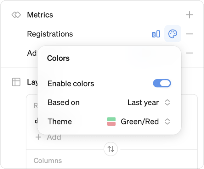
Based on decides what the colors measure:
- Actuals: shades cells by the metric value itself
- A comparison period: colors cells by whether the value came in above or below that period
- A target: colors cells by whether the value came in above or below target
The options follow the comparisons and targets you have added to the metric. Add one first to color against it.
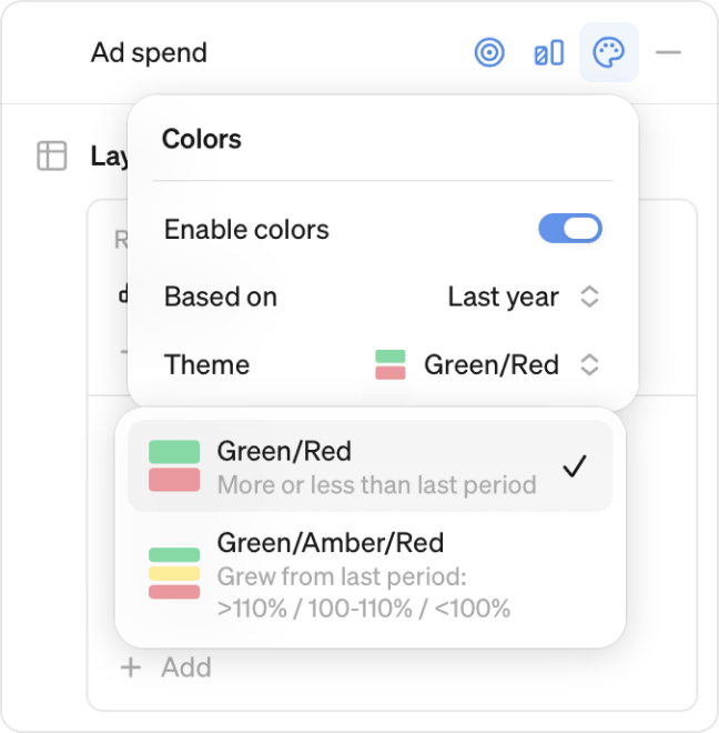
Theme sets the colors used:
- Monochrome shades cells in a single color, deeper for bigger values. This is the only theme when you color by actuals.
- Green/Red and Green/Amber/Red color cells green or red by whether they came in above or below. Both are available when you color against a comparison period or a target.
Layout
Layout decides the shape of your table. Breakdowns and time grains sit in either Rows or Columns, and you can put multiple on either axis.
The Metrics item in the layout is a placeholder standing in for all the metrics you added above. You choose which metrics to show, and their order, in the Metrics section. Where they appear is decided here.
Add breakdowns: click + Add under Rows or Columns and pick a breakdown or a time grain.
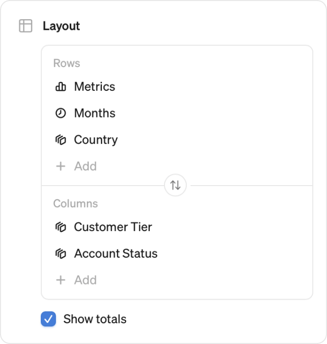
Change the hierarchy: the item at the top is the outer level, and each one below nests inside it. Country above City groups cities within each country. Drag metrics, time grains and breakdowns to reorder them, within a box or between Rows and Columns, and the hierarchy follows.
Transpose: click the transpose icon between Rows and Columns to move everything on the rows to the columns and everything on the columns to the rows in one go.
Time breakdowns: when a table is broken down by time, every period in the time range is shown, including periods without data. Cells with no data show a dash.
Show totals
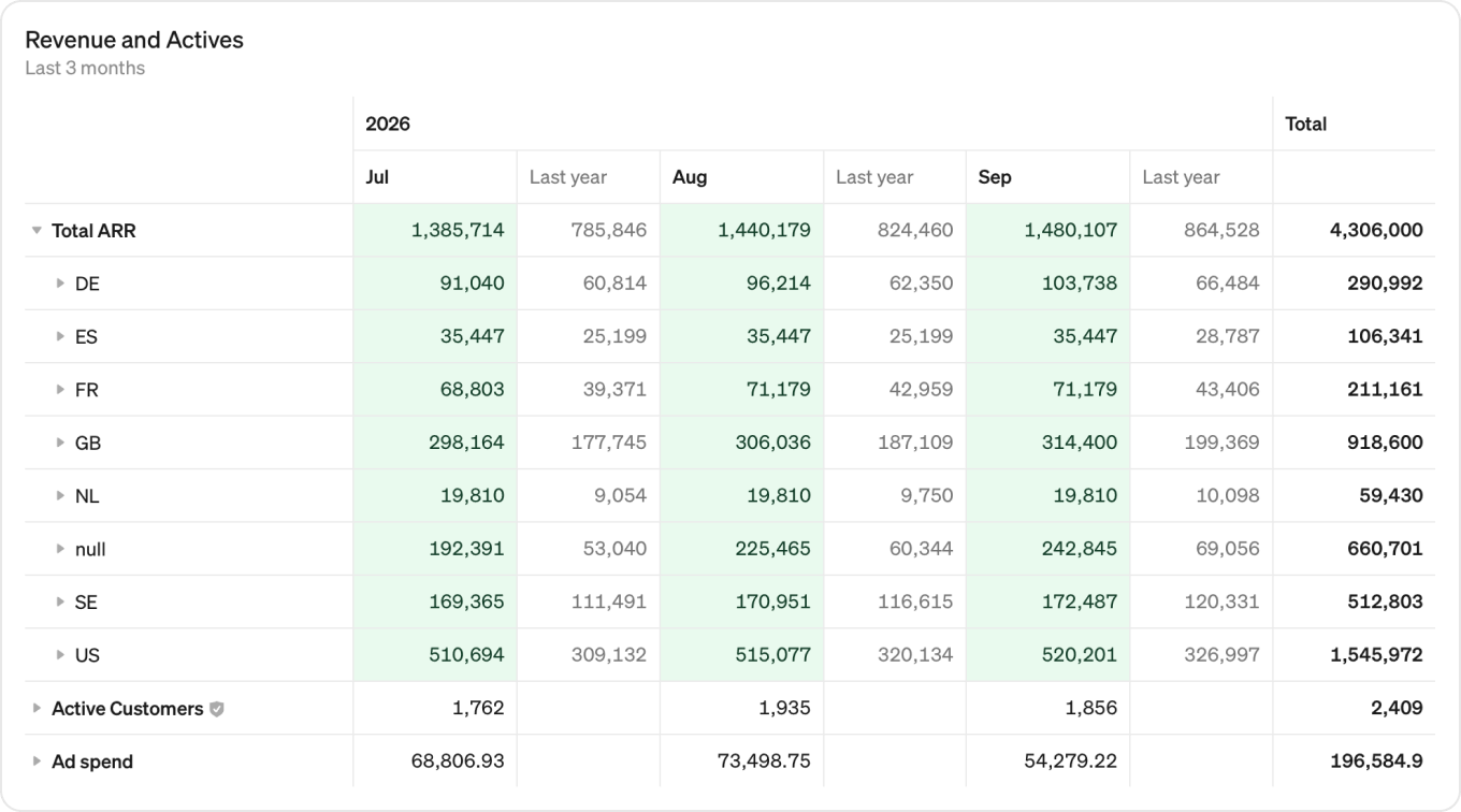
Turn on Show totals under the layout to add a totals column. Each row is added up across the periods it covers, so a table of query volume from April to September gains a column with those six months combined.
Note
Tables display the first 100 rows per metric. If your layout produces more, the rest are not shown on screen. Download the CSV to get the full data, up to 1 million rows.
Filter
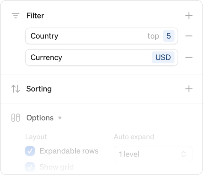
Click + next to Filter and pick a dimension, then choose how to narrow it down. Active filters are listed in the edit panel and along the bottom of the table.
Is
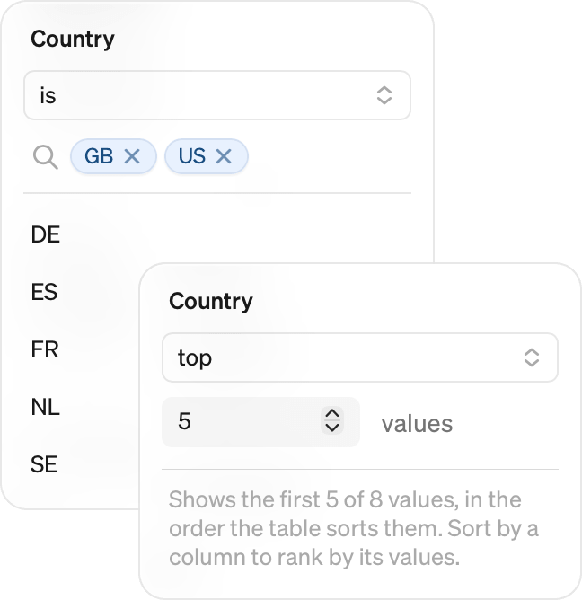
Set the operator to is and select the individual dimension values you want to include. This works for any dimension, whether or not it appears in the table.
Top
Set the operator to top and enter a number to show only the first values, in the order the table sorts them. Sort by a value column first if you want the biggest, for example the top 10 countries by revenue.
Top is only available for dimensions that are in your layout. To narrow down a dimension that is not in the table, use is instead.
Top applies within the hierarchy rather than across the table as a whole. If your rows are countries with cities nested underneath and you set top 4 on the cities, you get the top 4 cities for each country.
Report filters also apply to tables. Read more about filters.
Note
Top replaces the breakdown limit from the old tables, so it now applies to exported data as well as to what you see.
Sorting
Click + next to Sorting to choose what the table sorts by. Rows and columns are sorted separately, so you can set one, the other, or both.
Each one takes the same three kinds of option:
- A dimension sorts alphabetically, so countries run A to Z.
- A time grain sorts chronologically, oldest period first.
- A value sorts by number, largest first. Sort the rows by a column of values, or the columns by a row of values.
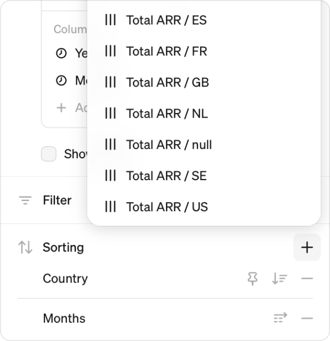
Click the direction icon to reverse any of them.
Pin a value: click the pin icon to keep specific dimension values at the top, whatever the sorting says. Sort countries by revenue but keep Canada in first place. Pin several values and drag them to set the order they appear in.
Sorting works within the row hierarchy, so sorting by a value column reorders rows inside each group without breaking the groups apart.
Options
Expandable rows: collapse the table so each row opens to reveal the level beneath it. Metrics broken down by country and then city start as one row per metric. Expand a row to see the countries, then expand a country to see its cities. Totals appear automatically when this is on.
Auto expand: choose how many levels are already open when the table loads. None shows the top level only, and the levels on offer follow the number of breakdowns you have added.
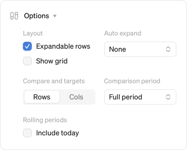
Compare and targets: set this to Rows or Cols. It applies to every metric in the table. As rows, each comparison and target sits under its metric. As columns, each sits next to the value it compares to.
Comparison period: comparisons show the full prior period by default. Set this to To date to compare only up to the same point in the prior period, for example the first 15 days of this month against the first 15 days of last month.
Include today: for rolling periods, show today's data where possible.
Work with table blocks
Full width
If your table has many columns, toggle the full width button in the top right corner of the table to match the width of your screen. The table will only be resized if needed.
More options
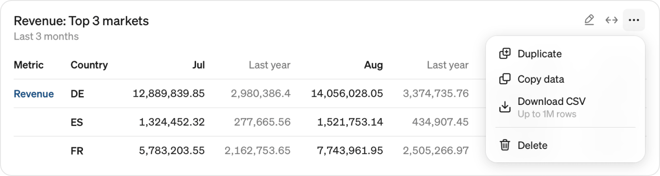
Click the ⋯ button in the top right corner of a table block to show more options.
- Duplicate: duplicate the table within the report.
- Copy data: copy all data in the table to the clipboard to paste it into any external document.
- Download CSV: download the full underlying data as a CSV file, with up to 1 million rows, including rows not visible in the report. Dates are exported as full date labels.
- Delete: remove the table from the report.