Learn about Steep core concept →
For everyone
Everyone can explore metrics freely
Explore
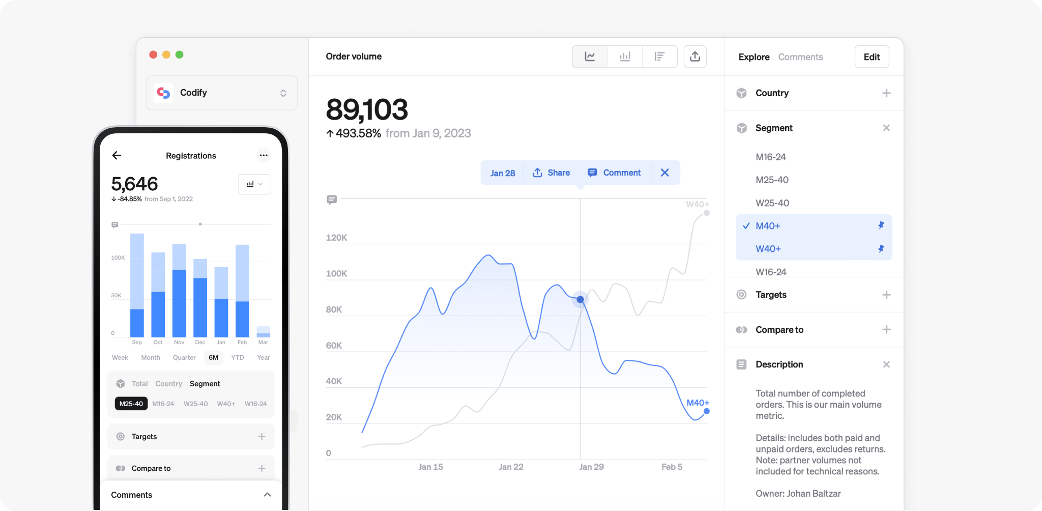
Explore is a view for everyone to freely analyze a metric. It reflects the way a metric is defined.
You can get to explore view by:
- Clicking on a widget from the home screen or team space.
- Clicking on a metric from the metric catalog.
- In reports, on any chart, click “…” > Go to metric.
- In reports, on any table, click on the metric > Go to metric.
Charts
Every metric has five main visualizations: line, bar, rank chart, pivot table and cohort table. If you want to save a chart, it can be added to an existing or new report. Learn more about reports.
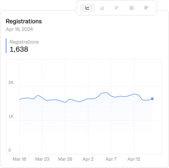
Line chart
Go to any metric. Pick ‘Line chart’ in the chart selector at the top right of your screen.
Line charts present data as a time series to measure change over time. Click or tap anywhere on the line to see the exact value.
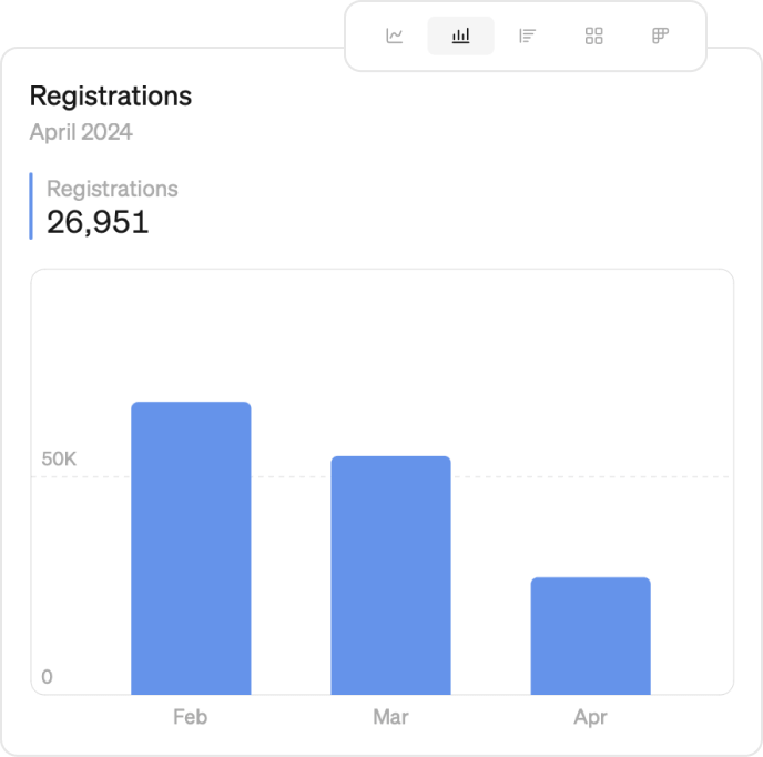
Bar chart
Go to any metric. Pick ‘Bar chart’ in the chart selector at the top right of your screen.
Bar charts present data as a time series to measure change over time. Click or tap on any bar to see the exact value.
Rank chart
Go to any metric. Pick ‘Rank’ in the chart selector in the top right of your screen.
Rank charts present a vertical dimension breakdown, a top list of your dimension. Next to each bar, you find values and percentages.
Rank is available for metrics with one or more dimensions. Learn how to set up dimensions on Define metrics
![]()
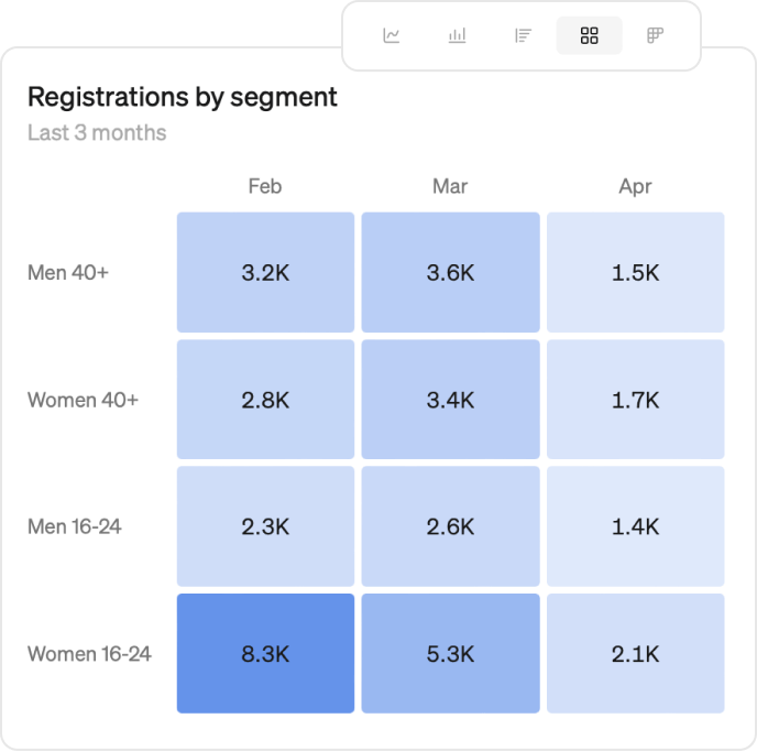
Pivot table
Go to any metric. Pick ‘Pivot Table’ in the chart selector in the top right of your screen.
Choose to breakdown the metric by two dimensions or by one dimension and time.
Create a heat map using one of the built-in color themes, and fine-tune the color thresholds to make the data speak to you.
Pivot table is available for metrics with one or more dimensions. Learn how to set up dimensions on Define metrics
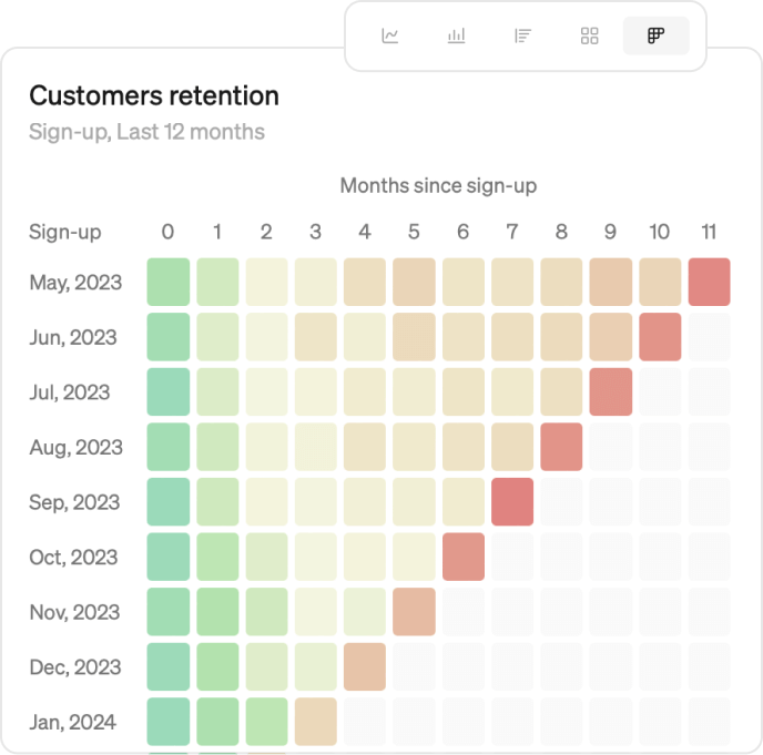
Cohort table
Go to any metric. Pick ‘Cohort Table’ in the chart selector in the top right of your screen.
Choose to breakdown the metric by the cohort or a metric dimension.
Create a heat map using one of the built-in color themes, and fine-tune the color thresholds to make the data speak to you.
Cohort tables are available for metrics with a cohort defined. Learn how to set up a cohort.
Time options
Use the time controls to find the time frame you want to explore. Quickly zoom out to a year or zoom in on a week. Use the time stepper to step back and explore data from the past.

You can explore data either by a rolling period, calendar period or custom date range
| Rolling period examples | |
|---|---|
| Week | last 6 days rolling |
| Month | last 30 days rolling |
| Quarter | last 3 month rolling |
| 6 month | last 6 month rolling |
| YTD | Jan 1st this year – yesterday |
| Year | last 365 days rolling |
| Calendar period examples | |
|---|---|
| Week | this week, Monday until today |
| Month | this month, MTD |
| Quarter | this quarter until today |
| Year | this year, YTD |
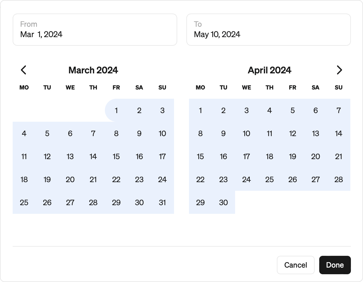
Custom date range
Select 'Custom' from the date options at the bottom of the screen or click the time stepper to select a custom date range. Select the start and end date from the custom date picker.
Include today's data
For visualizations on a daily time grain with a rolling period (for example Last 7 days or Last 30 days), you can choose to include today's data.
This is available for all chart types in Steep and affects both Explore and saved visualizations (such as report blocks and widgets).
- Totals over a period (for example big numbers, pivot tables, and rank charts): totals include today's data.
- Charts with a daily axis (for example line and bar charts, pivot tables, and report tables): you get an extra data point for today.
You can turn this on for one visualization from Options > Include today.
Using time grains in Steep
Time grains control how your data is grouped over time—daily, weekly, monthly, quarterly, or yearly. They help you explore trends at the right level of detail.
How to change the time grain
To adjust the time grain on a line or bar chart, click the time grain dropdown next to the time stepper below the chart. You can choose from:
- Daily
- Weekly
- Monthly
- Quarterly
- Yearly
- Auto
Auto time grain
When set to Auto, Steep will automatically adjust the time grain based on the time range you're viewing in bar charts. This gives you the right level of granularity without needing to manually switch between daily, weekly, or monthly views.
How time grains are applied in Steep
Steep only includes time periods that are fully complete within the range you’re viewing.
For daily rolling periods, this behavior can be adjusted by turning on Include today. When enabled, today is included even though the day is still in progress.
For example, if you’re looking at March 2025 on a weekly bar chart:
- Steep will display only the 4 full weeks that start and end within March.
- Weeks that start in February or end in April won’t be shown, since they aren’t fully contained in March.
This ensures clean, consistent comparisons—no partial weeks or months to skew your view.
Dimensions
Dimensions provide breakdowns of your metric. You can use them to deep dive into a metric by, for example, markets, customer segments, or product categories.
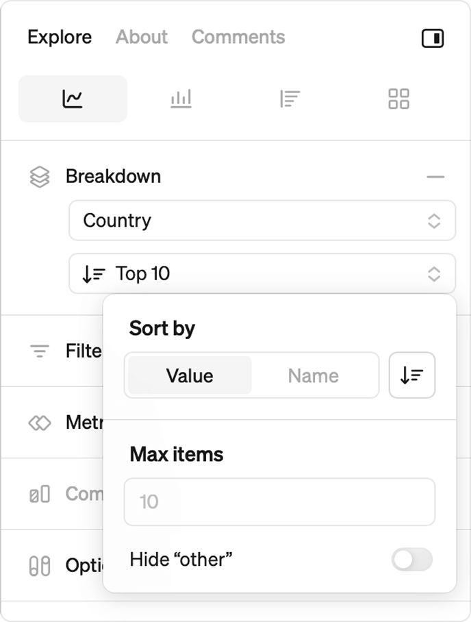
Breakdown
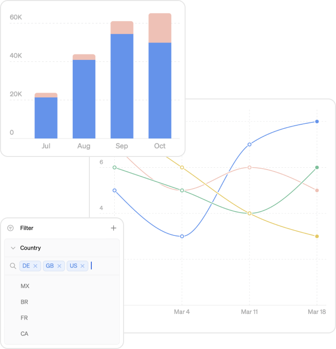
You can break down your data by any metric dimension, for example ‘Country’.
By default, Steep shows the top 10 dimension values when you break down a metric. You can now customize what’s shown by clicking the "Top 10" button next to the breakdown label.
Sorting Options
When you click "Top 10", you’ll see two sorting options:
- Value: Show the top or bottom dimension values based on their totals over the full time period you're viewing.
- Name: Sort dimension values alphabetically, either A–Z or Z–A.
Max items: Choose the total number of dimension values displayed, upto 20.
Hide "Other": Choose to hide “Other” as a grouped category for any dimension values not shown in the chart.
- “Other” is automatically calculated for sum, count, and ratio metrics.
Please note
Steep calculates top and bottom dimension values based on the entire time range being displayed, not separately for each time period. For example, if you're viewing the last 6 months on a monthly time grain, Steep will show the top values across the full 6-month range and not the top values for each individual month.
Filter
You can choose which specific dimension values, such as countries, to display using 'Filters'.
Click the '+' next to 'Filter' to pick a dimension to filter by, like 'Country'.
Choose the countries you wish to see.
Combine filters and breakdown on the same dimension to see the data country by country. Using filters without a breakdown will provide total values for all selected countries in your filter.
Compare with filter
You can do various comparisons for dimension values using filters without a breakdown
This way you can compare a single dimension value, for example the country ‘DE’ with previous period, average or any other comparison.
You can also compare a total of specific dimension values, like the total of countries ‘DE’, ‘FR’ and ‘NL’, to the previous period or any other comparion, by combining filters and comparisons.
It’s not possible to combine a breakdown with a comparison.
Set up dimensions
Dimensions are only available when predefined for a metric. Learn how to set up dimensions on Define metrics
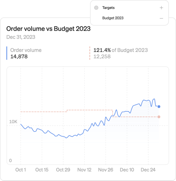
Targets
Toggle on 'Targets' to see how your metrics perform against your budget or forecast.
You find targets in the control panel next to the chart.
Targets are only available when predefined for a metric. Learn how to set up targets on Targets
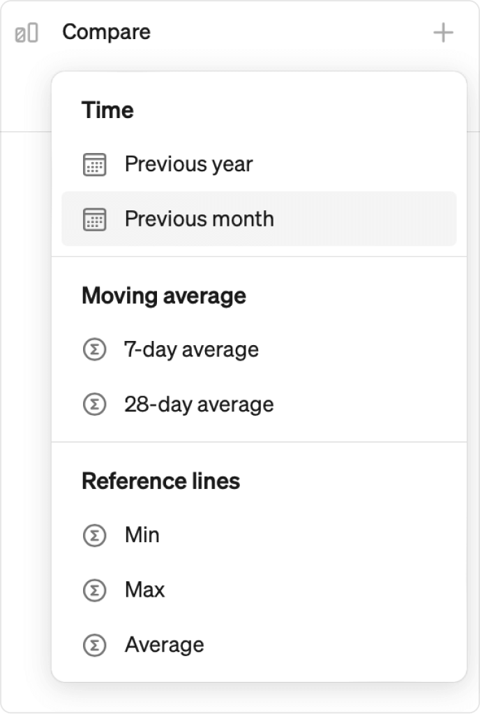
Compare
Previous period
Compare your metric to:
- Last period (week, month, quarter)
- Last year
- Last year (match weekday)
- 7-day average
- 28-day average
Period over period
Period-over-period comparison lines let you track changes across time—like month over month or year over year. Available for any time grain above daily.
Reference lines
Add reference lines to compare your metric to the Min, Max, or Average of the period currently being displayed.
Compare to date
Control how the comparison value is calculated.
- Full period: compares against the complete prior period. For example, if you're 15 days into January, the comparison value is calculated against all of December.
- To date: compares against the same point in the prior period. For example, January 1–15 is compared to December 1–15, not the full month.
To enable To date, open Options and set Comparison period to To date. When active, an indicator appears in the bottom-right corner of the chart showing the current comparison period. For example, MTD when comparing month to date, or YTD when comparing year to date.
Note: Comparison period requires the metric to have daily data available. It won't appear if the metric's smallest time grain is weekly or larger.
Compare metrics
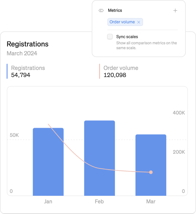
Overlay multiple metrics with just a click to easily see correlations and trends. Just expand the Metrics section and select a metric to get started. Once you have selected a metric, click on the icon to the right of the metric name if you want to change the Y-axis or chart type.
All metrics and slices can be added to the same chart.
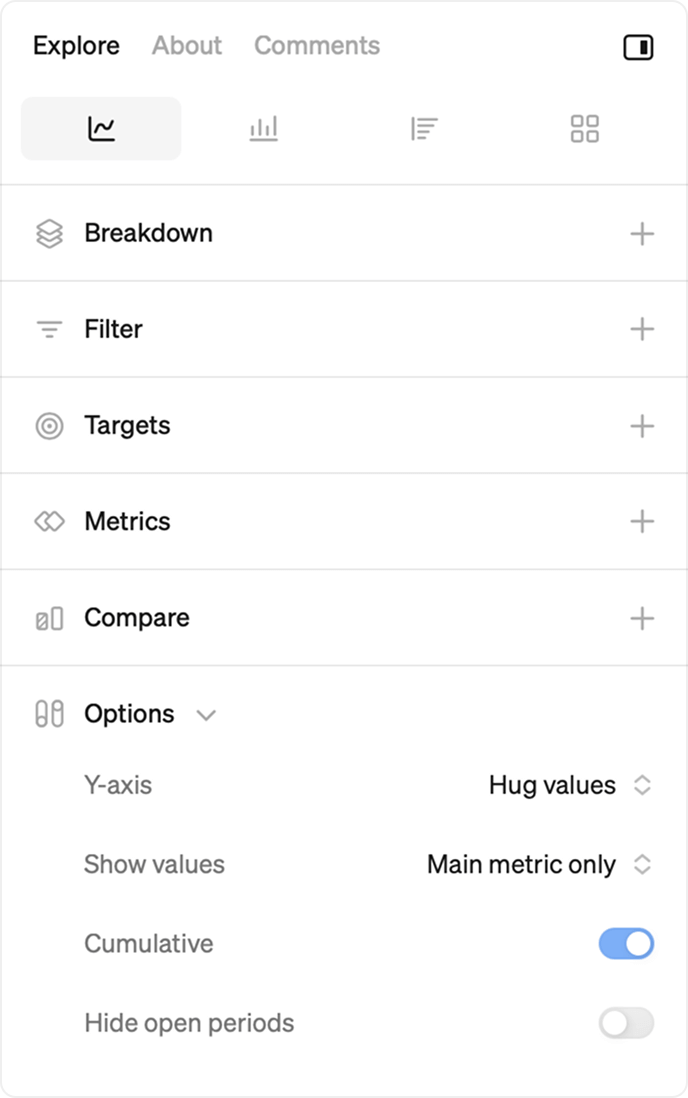
Line and bar chart options
- Y-axis: For line charts, choose whether the Y-axis should start at zero or hug the values. Hugging the values means the Y-axis will automatically adjust to the range of your data, making it easier to spot smaller changes and trends.
- Show values: Select how value labels are displayed on a chart under 'options'>'show values'. Show labels for the main metric only, all data series, or hide them entirely. The number of labels will adjust based on chart size, and always include the last value of the chart.
- Cumulative: Show the accumulated value of a metric over the selected time range. Available for sum, count and custom value metric types.
- Hide open periods: Exclude incomplete time periods from the chart to avoid skewed or misleading data.
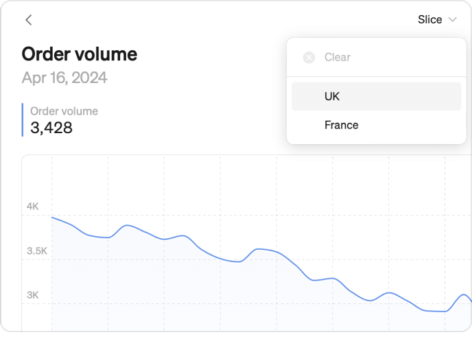
Slices
Slices are like sub-metrics. A way to quickly jump to a zoomed-in picture, while keeping the same source of truth.
You find slices on top of your screen, next to your metric name in explore mode.
Slices are only available when predefined for a metric. Learn how to set up slices on Define metrics
You can use slices for certain markets, channels, or product categories. Let’s say you have a metric for payment value, using slices you can define a slice for the markets Nordics, Netherlands and UK but also add a slice for a new product category you just launched.
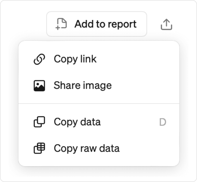
Copy data
Here’s how to easily copy data from the Explore view to use it in external tools like Google Sheets or Excel:
- Click the export icon at the top of the explore view.
- Choose from 'Copy data' which defaults to WYSIWYG or select 'Copy raw data' if you want it in a “tall” database format.
- Paste the data in your external tool.
- The keyboard shortcut for 'Copy data' from explore is (D).
Private metrics
Keyboard shortcuts
Widgets
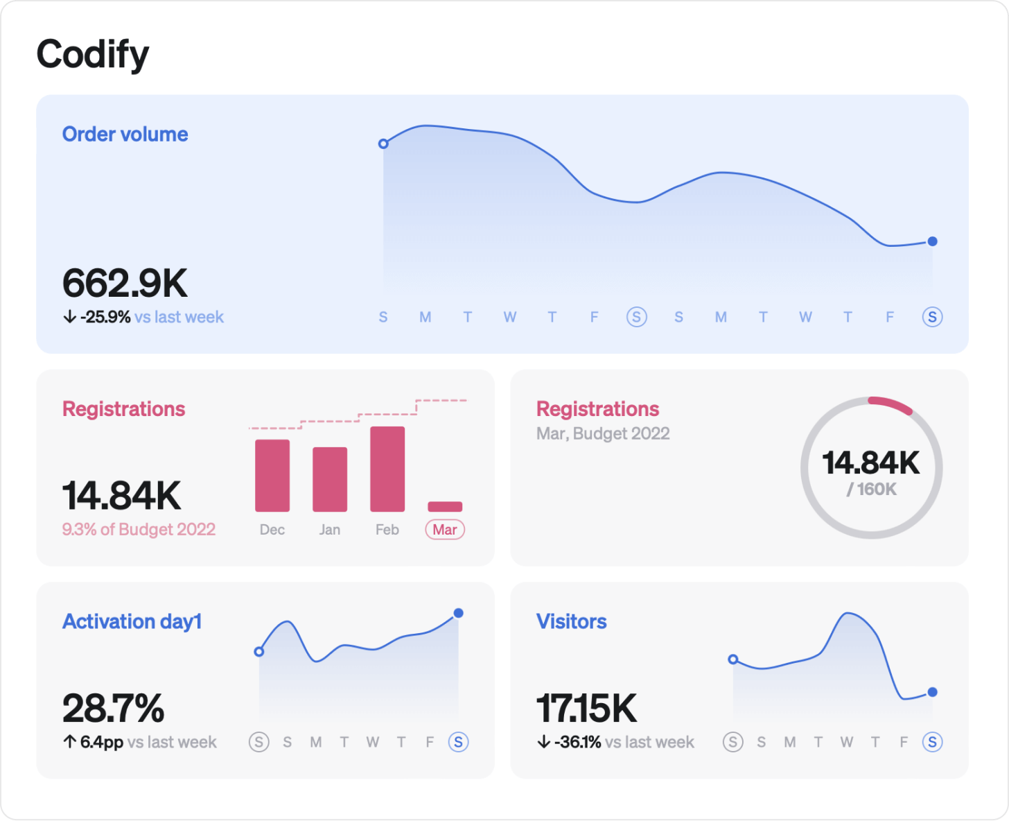
To get a quick overview of your metrics, you can add them as Widgets on the home screen. You can customize widgets in many ways,
- Colors
- Line graph, bar graph, milestone, big number
- Target
- Size
- Time grain
How to set up Home & team screens