Getting started:
H3 cell index format
To visualize metrics on a map in Steep, your geographic data must be in H3 cell index format.
H3 cell index:
If you have geographic data that is not in H3 Cell index format, it is possible to convert into H3 cell format. Check your database’s documentation for guidelines. If you're using Snowflake, this guide can help you convert your data into the correct format.
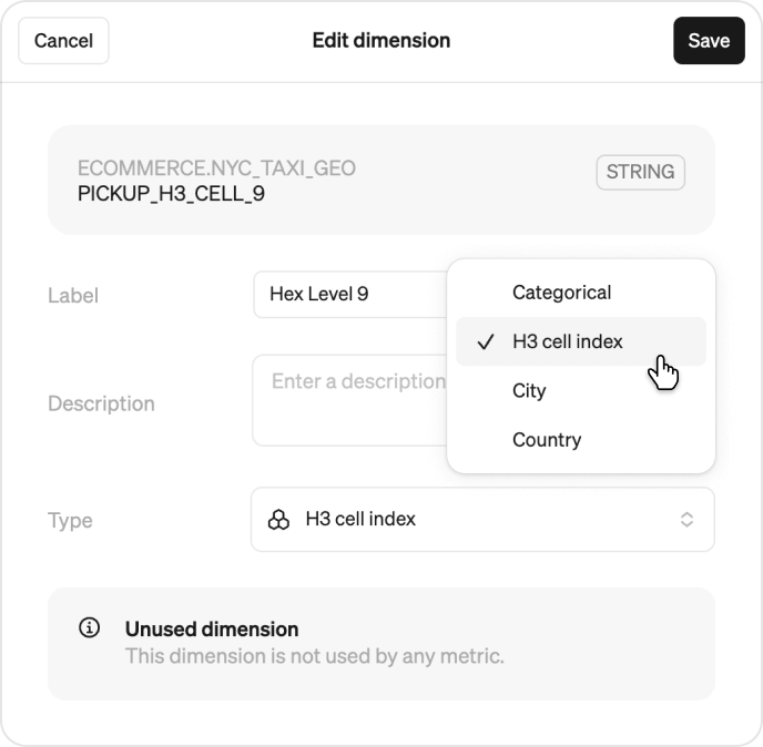
Set the dimension type
Once your table includes H3 cell index data:
- Go to Model > Modules
- Click on the module that contains your H3 cell index column
- Select or create the dimension using that column
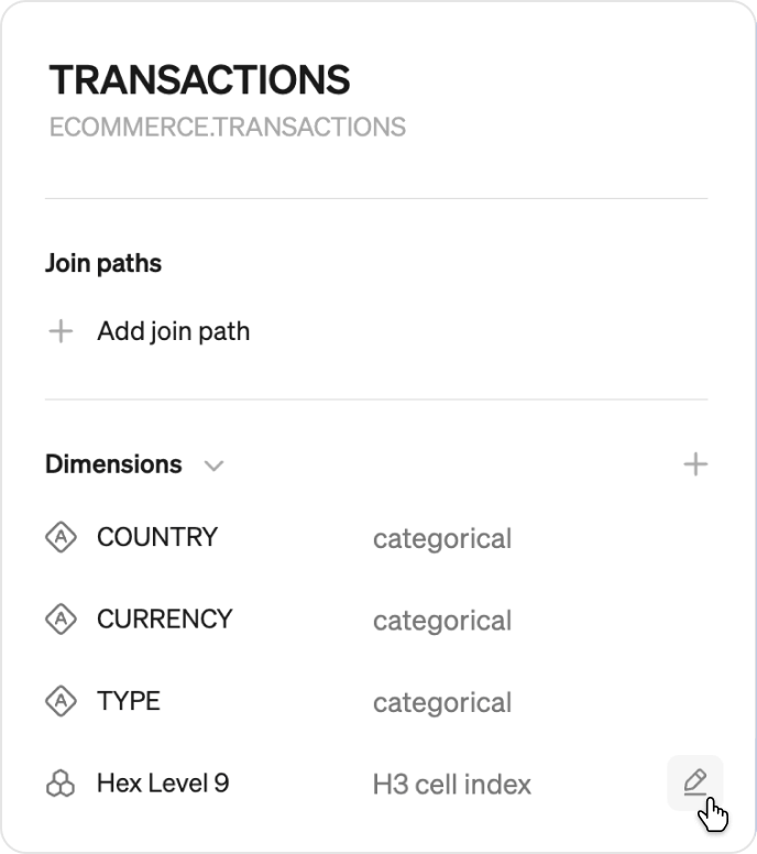
- In the Type field, choose H3 cell index
- Update the label. Steep automatically set’s the label to the name of the column in your table. This can be updated to help users understand the granularity. For examples, large, medium and small.
Note
Each precision level of the H3 cell index needs to be set as a different dimension. For city-level exploration, we recommend starting with level 8-10.
Add the dimension to relevant metrics
Once you created the dimension and updated the dimension type, you can add this dimension to your metrics. To do this, edit the metric and select the new dimension.
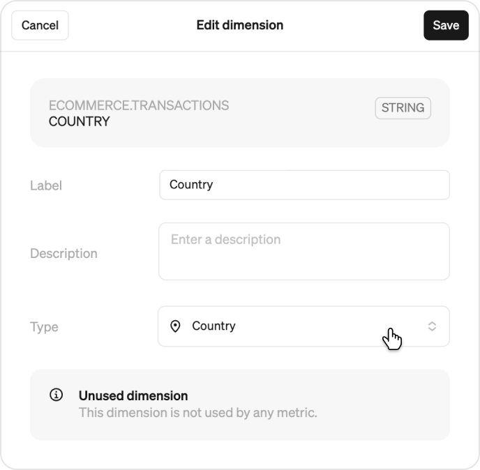
Set location dimensions (Optional)
If you have city or country dimensions, you can also set these location dimensions in Steep , allowing users to quickly filter on a particular location. This is especially important to do if you have a large amount of data you want to visualize on a map.
- Go to Model > Modules
- Click on the module that contains your location data
- Select or create the dimension using that column
- In the Type field, choose city or country
Now you’re ready to visualize your metrics on the map in Steep!
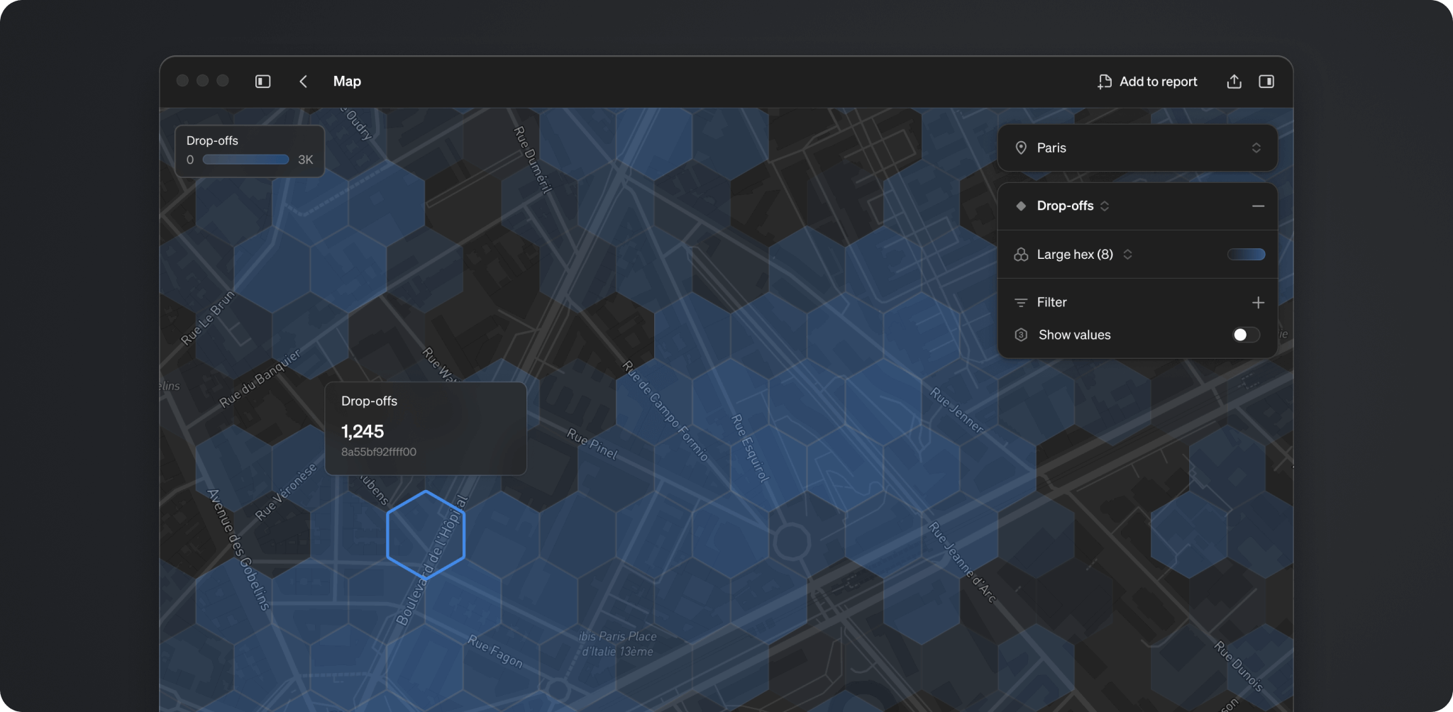
Exploring maps
You can start visualizing a metric on the map in three ways:
- From Maps in the right hand menu under Metric catalog
- From the explore view of metrics that have H3 Cell index dimension connected.
- You can create a map block directly in any report. Reports can have unlimited map blocks.
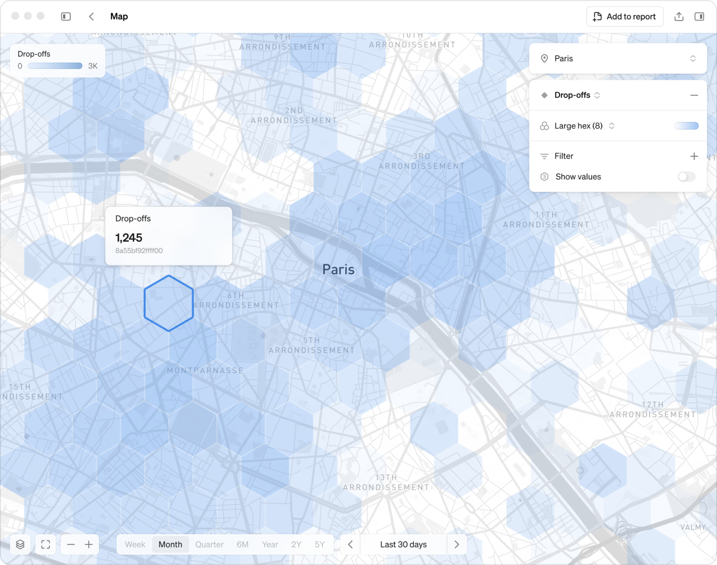
When you’re in the map view choose which metric you want to visualize by clicking + Metric
- Set the location if relevant.
- Select the breakdown, which is level of precision. The smaller the hexagon the more precise the aggregated data
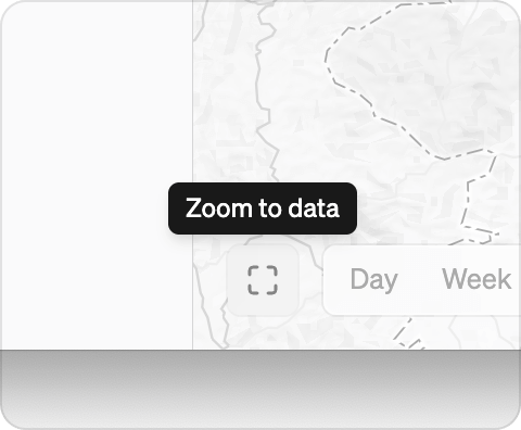
Zoom and navigate
Hold Shift and draw a rectangle on your map to zoom in on a specific region.
Click Zoom to data in the bottom right beside the time options to
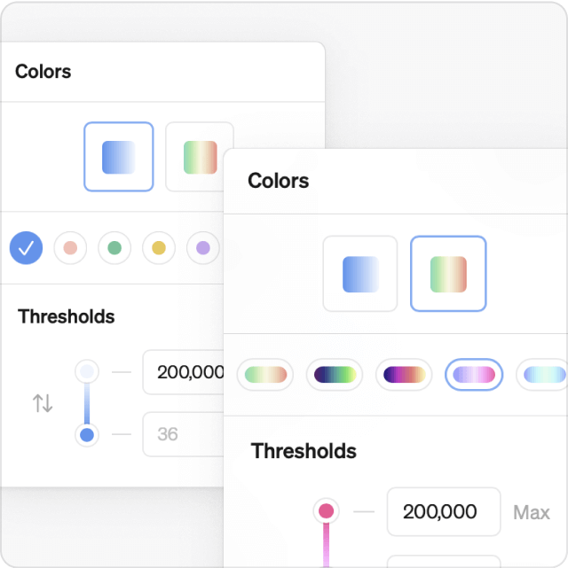
Colors
Customize map colors using:
- Seven monochromatic themes
- Five traffic light schemes
- Adjustable thresholds for more meaningful comparisons
Show values
Toggle on Show values to display the aggregated metric directly in each hexagon. Values will appear if there’s enough space in the hexagon to display the number.
Maps support in dbt cloud and Cube
Maps is currently not supported for semantic layer integrations.